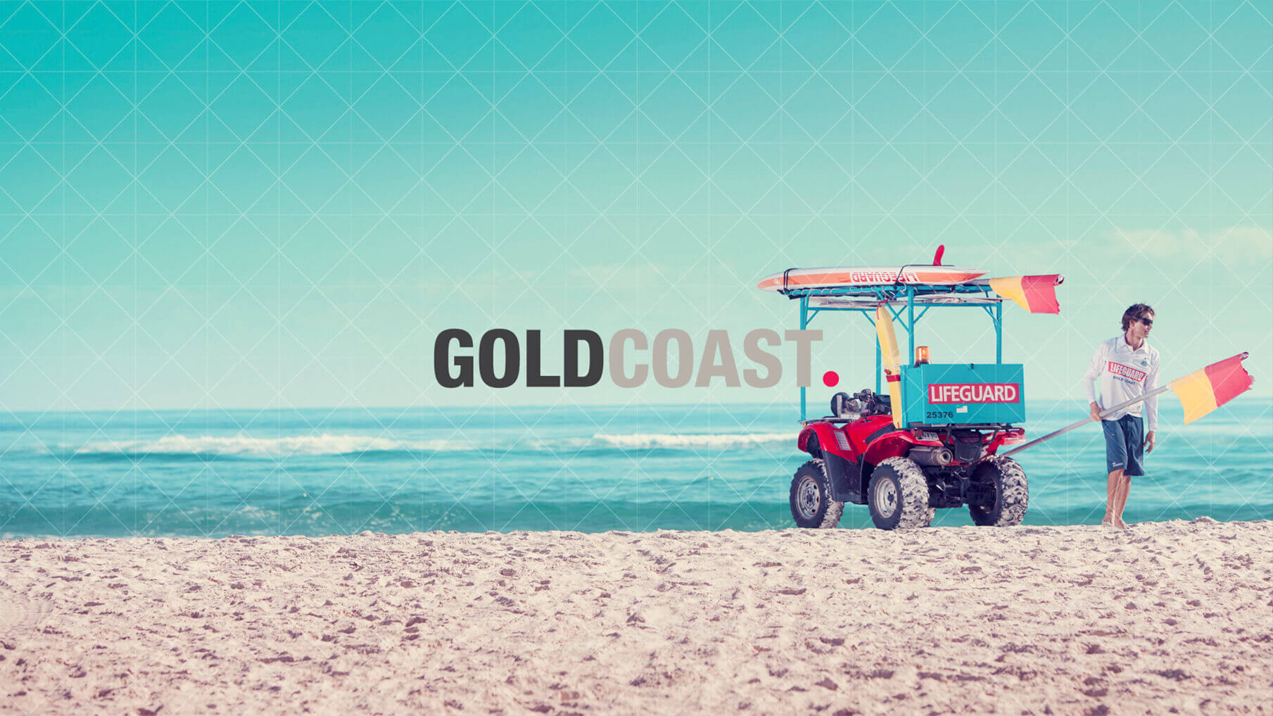
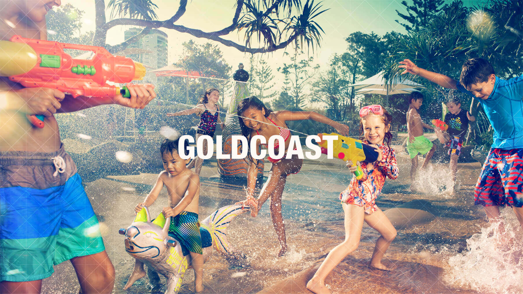
The Gold Coast, Australia City Council needed a new logo and look and feel for the rapidly expanding city. Any change of this scale was naturally going to draw some backlash as the cost of updating every asset in the city with the new logo was going to be considerable.
The Gold Coast had evolved from its sun and beach reputation and had become a flourishing city in its own right, with its own personality and quirks. In fact, when doing research, it seemed everyone had a different opinion about it. Some people loved it, some people hated it. It represented so many different things to so many people – and they were all valid. Within Gold Coast City Council, it was accepted that not everyone would love the new brand, but everyone could be included.
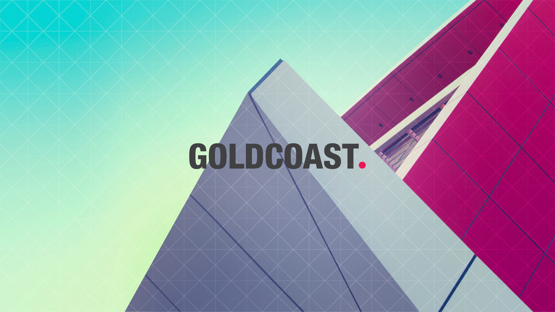
The opinions voiced in the market research were very strong and very defined. The new logo needed to incorporate them all. So, instead of creating a tagline that would never do the breadth of opinions justice, the two words ‘Gold’ and ‘Coast’ were joined into one and a full stop was added to create ‘GOLDCOAST.’ Every opinion was embraced because love it or hate it, it’s the GOLDCOAST, full stop.
A website invited people to share their opinion about the city in a floating circle – a full stop. Everything was acceptable – good, bad, rude – it was all valid. These full stops were then grouped with others on the site that shared similar words or opinions, allowing people to see who else had similar perspectives. Every dot, with every opinion, then resolved to form the full stop in the logo.
As expected, everyone had an opinion. Some loved it, some hated it, but because the opinions were all valid, nobody could disagree that it fit the city perfectly.